Portfolio Wallet · Fintech · 2026
Alpha Portfolio
Designing a unified portfolio and margin experience for crypto traders.
01 — Context
Bitso Alpha lacked a dedicated portfolio experience. Spot balances and margin information lived in separate surfaces, making it difficult for users to understand their total financial position, margin exposure, and overall risk.
02 — The Challenge
Users couldn't answer six fundamental questions about their own money.
What is the total value of my portfolio?
How much of my funds are currently at risk?
Which balances are mine vs. borrowed?
Is my margin position healthy?
What should I do next?
Where am I most exposed?
03 — What I did
As the sole product designer on the project, I owned the full design process from research to handoff.
Defined the information architecture
Unified Spot and Margin into a coherent portfolio experience.
Led 4 cross-functional workshops
With Product, Content, Frontend, and Backend Engineering.
Designed the margin health framework
Visual states, thresholds, and contextual messaging.
Created the high-fidelity UI
For the Overview, Spot, and Margin layers of the experience.
Mapped the event tracking strategy
In Amplitude, for post-launch measurement and iteration.
Aligned stakeholders
On MVP scope and prioritization criteria across teams.
04 — Before
How users experienced it before.
Before this project, Spot and Margin lived in completely separate sections of the platform. Users had to navigate between surfaces, mentally combine balances, and infer their risk exposure without any unified view.
05 — Discovery & Research
I analyzed how advanced trading platforms structure portfolio data.
To inform the new direction, I conducted a competitive analysis of advanced trading platforms — primarily Binance and Kraken — focused on how they structure portfolio data, communicate margin risk, and surface debt visibility to users.
What we learned
Conceptual separation, real confusion
Platforms separate Spot and Margin in their architecture, but users still struggle to understand their real exposure.
Visible but unclear
Margin risk indicators are present, but rarely contextualized in ways users can act on.
Cognitive overload
Borrowed funds, collateral, and equity are often mixed together — increasing the mental load.
Data over clarity
Most portfolio structures prioritize trading data over financial understanding.
06 — From insights to product direction
Instead of replicating competitors, we aimed for clarity.
The gap was clear: platforms expose massive amounts of financial data, but the relationship between Spot balances, borrowed funds, risk exposure, and overall portfolio health remains opaque.
Instead of replicating competitor structures, Alpha needed a portfolio experience that helped users quickly answer a few key questions.
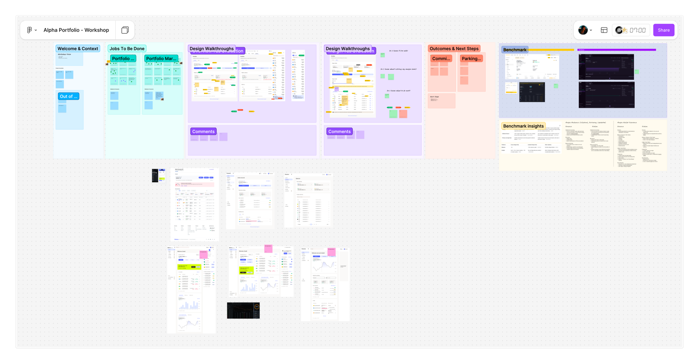
From conversations to alignment
To align on this direction, I facilitated collaborative workshops with Product, Content Design, Frontend, and Backend Engineering. The goal: transform a complex financial model into a clear, actionable experience.
These sessions were key to reducing ambiguity early and establishing a shared understanding before moving into high-fidelity design.
07 — Structuring the experience
Three progressive layers, designed for different levels of complexity.
One of the project's main design challenges was deciding how Spot and Margin should coexist inside the same experience without overwhelming users. I restructured the portfolio into three progressive layers:
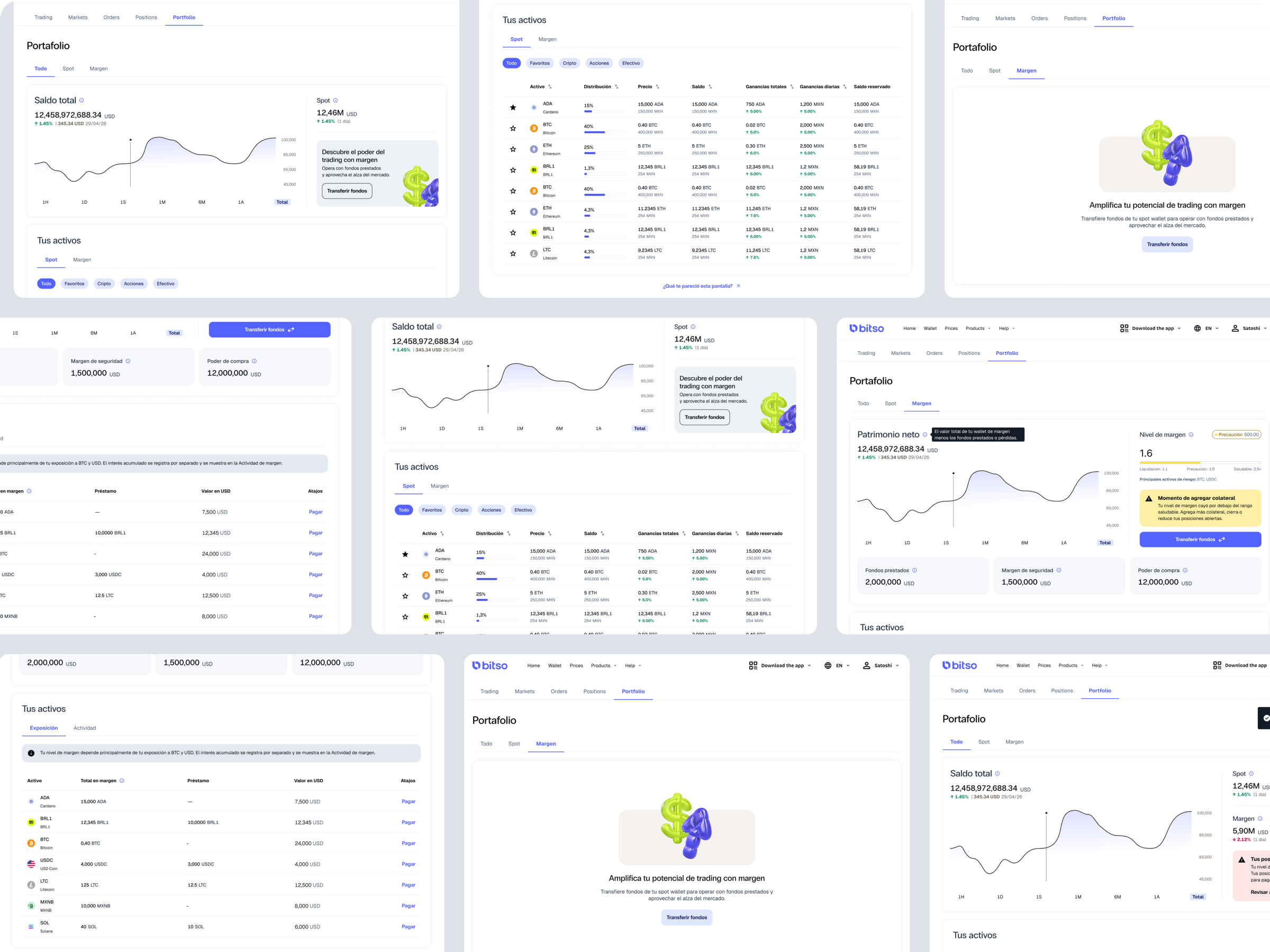
Overview
A high-level summary of the user's total portfolio value, performance, and margin status.
Designed to answer
"What is my current financial situation?"
Consolidates
Total balance, Spot vs Margin distribution, Margin health, Risk states, Portfolio evolution
Spot
A dedicated section focused on owned assets and balances.
Prioritizes
Asset visibility, Distribution across holdings, Earnings and reserved balances
Margin
An advanced environment centered on exposure, debt, and risk management.
Introduces
Borrowed balances, Net equity logic, Margin health states, Liquidation messaging, Transfer and repay flows
This separation created progressive complexity: users can start with a simple portfolio understanding and access advanced margin information only when needed.
Information architecture
The full anatomy of Alpha Portfolio.
Hover over a branch to explore
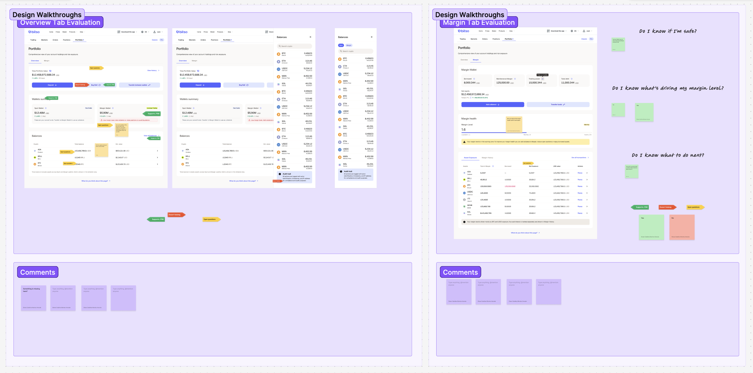
08 — Designing for risk: the health system
Turning complex risk into clear actions.
A critical part of the experience was designing a margin health system that communicates financial risk clearly — without relying only on technical terminology.
I designed a scalable framework with three states, each including visual indicators, threshold logic, contextual explanations, and suggested next actions.
The objective wasn't just to alert users — it was to help them understand why they were at risk, what caused it, and what they could do about it. In high-risk trading scenarios, this clarity is the difference between confidence and panic.
Healthy
Stable position with safe collateralization.
Warning
Approaching liquidation thresholds. Action recommended.
Liquidation risk
Immediate action required to avoid liquidation.
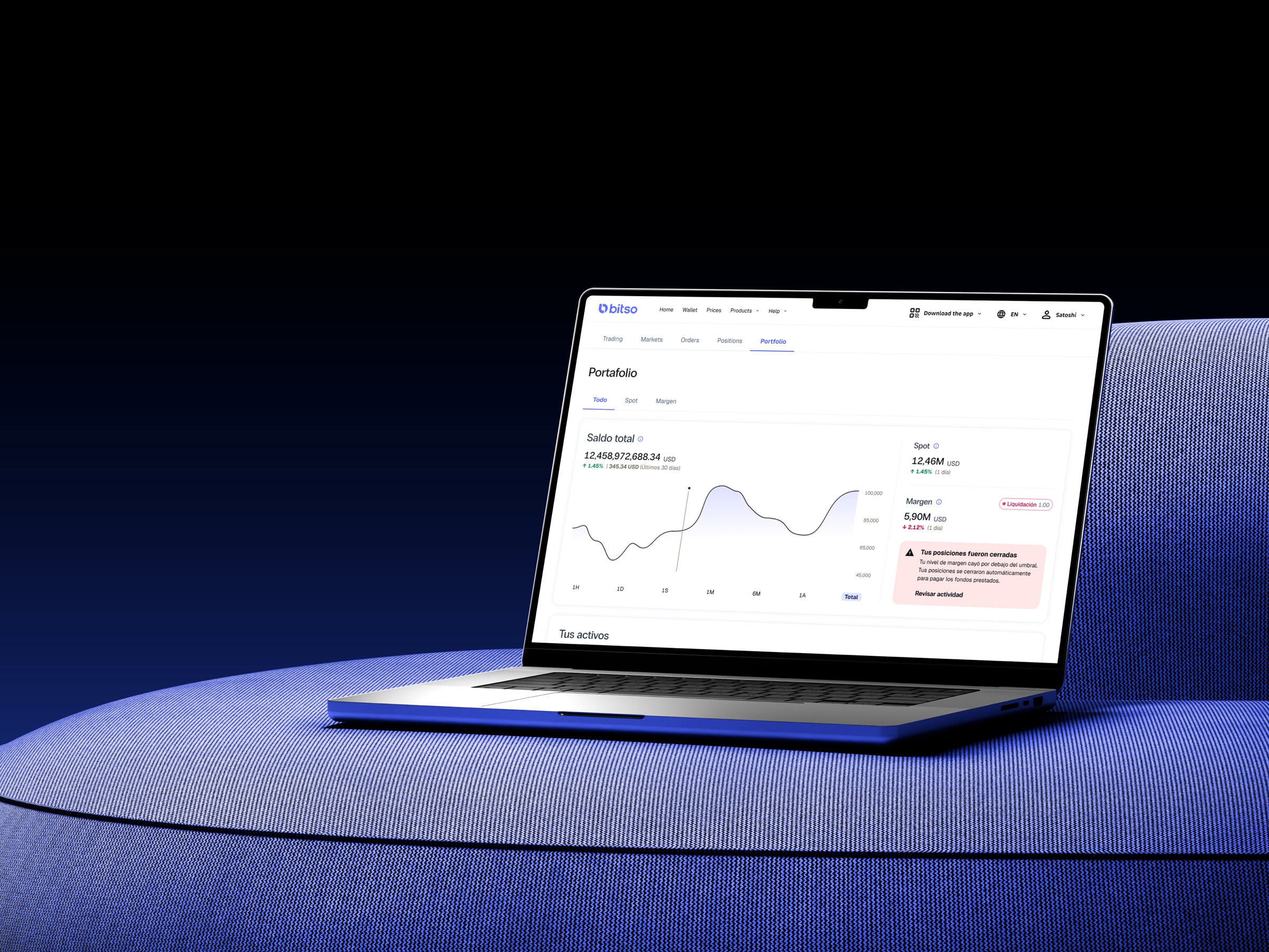
09 — The final experience
Bringing it all together.
10 — Impact & outcomes
A unified entry point for portfolio understanding.
Alpha Portfolio launched as the unified entry point for both new and advanced users on Bitso Alpha. The new structure:
Reduced cognitive distance
Between owning, owing, and understanding risk.
Enabled progressive disclosure
Users can engage with margin complexity at their own pace.
Established a scalable framework
For future features like lending, staking, and derivatives.
Created shared vocabulary
Across Product, Engineering, and Content teams.
Post-launch tracking via Amplitude is set up to measure adoption of margin features, frequency of health-state interactions, and reduction in support tickets related to portfolio confusion.
11 — Reflections
What I learned
Designing for financial complexity isn't about hiding information — it's about layering it. Users want depth, but only when they're ready for it.
What I'd do differently
I'd invest earlier in usability testing with real Margin users. Most of our directional decisions came from competitive analysis and stakeholder workshops, but real users would have surfaced edge cases we discovered later in the design process.